 1
 2
 3
 4
 5
 6
 7
 8
 9
10
11
12
13
14
15
16
|
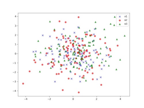
import matplotlib.pyplot as plt
import numpy as np

mu_vec1 = np.array([0,0])
cov_mat1 = np.array([[2,0],[0,2]])

x1_samples = np.random.multivariate_normal(mu_vec1, cov_mat1, 100)
x2_samples = np.random.multivariate_normal(mu_vec1+0.2, cov_mat1+0.2, 100)
x3_samples = np.random.multivariate_normal(mu_vec1+0.4, cov_mat1+0.4, 100)

plt.figure(figsize = (8,6))
plt.scatter(x1_samples[:,0],x1_samples[:,1],marker='x',color='blue',alpha=0.6,label='x1')
plt.scatter(x2_samples[:,0],x2_samples[:,1],marker='o',color='red',alpha=0.6,label='x2')
plt.scatter(x3_samples[:,0],x3_samples[:,1],marker='^',color='green',alpha=0.6,label='x3')
plt.legend(loc='best')
plt.show()
|